A weak homepage does not usually fail because the design is bad. It fails because visitors land on it and still cannot answer three simple questions: What is this? Is it for me? What should I do next?
That is the real job of a Squarespace homepage. It is not there just to look polished. It needs to speak clearly, guide fast, and help the right visitor take the next step. If the message is vague, too clever, or stuffed with filler, people leave. They do not keep reading to “figure it out.” They click away.
Many business owners spend weeks choosing colors, fonts, and layouts, but only a few hours writing the words that sit on the page. That is why so many homepages look nice but do very little. A strong homepage should explain your offer in plain language, show why it matters, build trust, and move people toward action.
This matters even more when you are working on homepage design in Squarespace. The platform gives you clean templates and a simple editing experience, but the words still do the heavy lifting. A good layout can support your message. It cannot fix a weak one.
In this guide, you will learn what to say on your Squarespace homepage, what to avoid, and how to structure each section so your message is clear from the first screen to the final call to action. Whether you are building the site yourself or working with a Squarespace web design agency, these guidelines will help you write a homepage that makes sense to real people. It can also help you get more value from your build if you are thinking about Squarespace website design cost and want your homepage to work harder for your business.
Why Your Squarespace Homepage Message Matters So Much
Your homepage is often the first page people see. Even if a visitor enters through a blog post, service page, or social link, many still click back to the homepage to understand your business. They want the short version before they go deeper.
A homepage has to do several jobs at once:
- Explain what you do
- Show who you help
- Make your business feel credible
- Point people to the right next step
- Remove confusion quickly
That is why the message matters more than many people think. A homepage is not just an opening statement. It is a decision page. Visitors use it to decide whether they should stay, click, contact you, or leave.
What visitors look for in the first few seconds
When someone lands on your homepage, they are not reading every word. They scan. They pick out the headline, subheading, image, buttons, and a few bold phrases. In that short window, they are trying to answer:
1. What do you do?
This should be obvious without any guessing. If you are a photographer, say you are a photographer. If you sell handmade candles, say that. If you offer brand strategy, say it in a way a normal person would understand.
2. Who is this for?
Visitors want to know if they fit. A homepage that tries to speak to everyone usually feels weak. The more clearly you identify your audience, the easier it is for the right person to say, “This is for me.”
3. What should I do next?
A homepage should guide action. That action might be booking a call, viewing services, shopping products, joining a list, or reading more. If the next step is unclear, many visitors do nothing.
Why this matters in homepage design in Squarespace
Good homepage design in Squarespace often starts with layout choices such as section spacing, buttons, images, and content blocks. But the copy tells the visitor where to focus. Clean design gives your words room to work. Strong words make the design useful.
Squarespace templates can look polished very quickly. That is helpful, but it can also hide messaging problems. A site may feel “done” because it looks organized, even when the homepage still says very little. That is why you should treat writing as a core part of the build, not the last step.
What’s new With: Virtual Data Room vs Google Drive: What Founders Get Wrong
What Your Squarespace Homepage Should Say First
The top of the page matters most. This is where visitors decide whether to continue. Your first screen should not try to say everything. It should say the most important thing clearly.
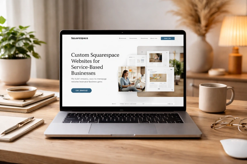
The headline should say what you do
Your headline is not the place for vague brand poetry. It should explain your offer in simple words.
Here are weak examples:
- Helping brands grow with purpose
- Design for modern businesses
- Creative solutions for bold ideas
These lines may sound polished, but they do not say much. A stranger still does not know what the business actually does.
Here are clearer examples:
- Custom Squarespace websites for service-based businesses
- Wedding photography for relaxed couples in Chicago
- Organic skincare for sensitive, acne-prone skin
These work because they tell the visitor what the business offers right away.
The subheading should add context
Once the headline says what you do, the subheading can explain who it is for, what makes it useful, or what result it supports.
Examples:
- We design clear, easy-to-manage Squarespace sites for coaches, consultants, and creative founders.
- Natural products made for skin that reacts to harsh ingredients.
- Fun, documentary-style wedding photos that capture the day as it felt.
A strong subheading supports the headline. It should not repeat it word for word.
Your first call to action should feel obvious
Your main button should reflect what the visitor is most likely to want next.
Common homepage CTA examples:
- Book a consultation
- View services
- Shop now
- See pricing
- Start your project
- Browse the portfolio
Avoid button text that feels soft or unclear, such as:
- Learn more
- Discover
- Explore now
These can work in some cases, but they often lack direction. A homepage CTA should tell people where the click will take them.
The Core Sections Every Squarespace Homepage Should Include
A good Squarespace homepage does not need ten random sections. It needs the right sections in the right order. Most strong homepages follow a clear path: explain, support, prove, guide.
Section 1 — Clear Hero Message
Your hero section is the opening block at the top of the homepage. This is where your main promise sits.
What to include in the hero
A direct headline
Keep it clear. Use plain words. Say what you offer.
A supporting sentence
Add who it is for, what problem it solves, or why it matters.
One main call to action
Choose the action that matters most.
A relevant visual
Use an image or background that supports the offer. It should help visitors understand the business, not distract them.
What to avoid in the hero
- Clever lines that need decoding
- Long blocks of text
- Multiple competing buttons
- Stock photos that say nothing about your work
- A giant logo with no clear message underneath
If someone cannot tell what you do from the hero section, the homepage is already struggling.
Section 2 — A Short “Who We Help” or “What We Offer” Block
After the hero, many visitors want a little more detail. This is the right place to explain your audience, services, or product range in a simple way.
What this section can do
You can use this block to say:
- Who your service is built for
- What problems you solve
- What types of services or products you offer
- What makes the experience easier or better
Example:
“We help service-based business owners build a strong online presence with custom Squarespace sites, strategic copy, and simple user journeys.”
That is specific without being too long.
Why this section matters
This block helps visitors self-identify. If the homepage headline caught their attention, this section helps confirm that they are in the right place.
In homepage design in Squarespace, this is often shown in a clean text block, a short intro with icons, or a three-column service summary. The layout can vary. The message should still stay simple.
Section 3 — Benefits, Not Just Features
One of the biggest homepage mistakes is listing what you offer without explaining why it matters.
Features tell people what is included. Benefits tell people why they should care.
Example of feature-focused copy
- 5-page Squarespace website
- Mobile-responsive design
- Contact form integration
- Blog setup
- SEO settings
That is useful, but dry. It reads like a checklist.
Example of benefit-focused copy
- A clear site structure that helps visitors find what they need fast
- A mobile-friendly experience that looks good on every screen
- Contact forms that make it easy for leads to reach out
- A blog setup that supports long-term content marketing
- Search-friendly page settings that support visibility
Now the offer feels more meaningful.
The best approach
Use both features and benefits, but lead with the value. This is especially useful if visitors are comparing providers, reviewing templates, or thinking about Squarespace website design cost. People do not only want to know what comes in the package. They want to know what it helps them do.
Section 4 — Trust Signals That Reduce Doubt
Trust should not be hidden at the bottom of the page. It should appear early enough to support decision-making.
Useful trust elements for a Squarespace homepage
- Client testimonials
- Star ratings
- Number of clients served
- Logos of past clients or publications
- Case study highlights
- Before-and-after examples
- Years in business
- Certifications or credentials
How to write trust-building copy
Do not just say:
- Trusted by many clients
- High-quality work
- Professional service
These claims are too broad.
Instead, be specific:
- “Trusted by 70+ service businesses across the US and UK”
- “Featured in…”
- “Average project rating: 5.0”
- “Recent client result: 42% increase in inquiry form submissions after launch”
Clear details feel stronger than empty praise.
Where to place trust on the homepage
A short proof section can sit just below the intro or benefits section. Longer testimonials can appear later. The point is not to overwhelm. It is to reduce doubt before visitors click away.
Section 5 — A Short Story About Your Business
People do not need your full life story on the homepage. They do need a reason to trust the person or team behind the business.
What to include
A short founder or brand section can cover:
- Who you are
- What you do
- Why you started
- What kind of clients you work with
- What your approach is like
Example:
“I started this studio after seeing too many small businesses launch sites that looked nice but did not explain what they offered. My work focuses on clear messaging, smart structure, and clean Squarespace builds that are simple to manage after launch.”
That feels grounded. It gives the visitor a human reason to care.
What to avoid
- A long biography
- Generic lines like “We are passionate about excellence”
- Every milestone since the business began
- A tone that feels too formal or self-important
Keep the homepage version short. Save the fuller story for the About page.
Section 6 — A Strong Services or Product Snapshot
Your homepage should not try to replace every service page. It should give a clear preview and guide people to the right next page.
For service businesses
Use short blocks for your core offers:
- Custom Squarespace website design
- Website copy support
- Template customization
- Ongoing website updates
Each block can include:
- The service name
- One or two sentences on what it does
- A link to the full page
For product businesses
Highlight categories or collections:
- New arrivals
- Bestsellers
- Shop by category
- Featured collection
Each section should make browsing easier.
Why this helps
This gives structure to the Squarespace homepage. It also supports SEO by helping users move through the site in a logical way. Strong homepage structure is part of strong homepage design in Squarespace, especially when your site needs to serve multiple audience needs without becoming messy.
Section 7 — Objection Handling
A great homepage answers questions before someone has to ask them.
Think about the doubts people may have:
- Is this right for my business?
- Can I afford this?
- Will this take too long?
- Do I need technical skills?
- How does the process work?
Ways to handle common concerns
You can answer these through:
- FAQ blocks
- Timeline summaries
- “What’s included” sections
- Pricing hints
- Process overviews
- Reassuring copy near CTAs
Example:
“You do not need to know how to edit code. Every Squarespace site is built so you can make simple updates on your own after launch.”
That kind of line removes friction.
Where Squarespace website design cost fits in
Many visitors think about price before they contact you, even if they do not say it. That is why Squarespace website design cost often affects homepage performance.
You do not always need full pricing on the homepage, but you should reduce uncertainty. You can do that by:
- Giving a starting price
- Mentioning package ranges
- Linking clearly to a pricing page
- Explaining what affects cost
- Showing what is included in your offers
When people cannot estimate cost at all, they may leave rather than inquire.
Section 8 — Clear Calls to Action Throughout the Page
A homepage should not rely on one button at the top and hope for the best. It should guide the visitor at different stages.
Why repeated CTAs help
Different visitors become ready at different moments. Some want to click after the hero. Others need proof first. Others want to read service details before deciding.
That is why repeated CTA placement helps.
Good CTA examples by business type
For a designer:
- View portfolio
- See packages
- Book a discovery call
For a coach:
- Work with me
- Read the process
- Apply now
For a shop:
- Shop bestsellers
- Browse collections
- View all products
CTA mistakes to avoid
- Too many different actions on one screen
- Vague labels
- Buttons with no support text
- Links buried in large paragraphs
- No CTA near the end of the page
What to Avoid Saying on Your Squarespace Homepage
Now let’s look at the common copy mistakes that weaken a homepage, even when the design looks polished.
Mistake 1 — Leading With Vague Brand Statements
Words like “intentional,” “creative,” “modern,” and “purpose-driven” are not bad words on their own. The problem is when they replace useful explanation.
Why vague copy fails
It sounds polished, but it does not inform. Visitors cannot act on a message they do not understand.
Weak example:
“We create meaningful digital experiences for bold brands.”
This could apply to almost any agency.
Stronger example:
“We design custom Squarespace websites for small businesses that need clear messaging, simple navigation, and a site they can update without stress.”
Now the visitor has something real to work with.
Mistake 2 — Talking Too Much About Yourself Too Soon
Visitors care about your business, but first they care about whether you can help them.
The wrong order
Many homepages start with a long business intro, founder story, or brand philosophy before saying what is actually offered. That slows people down.
A better order
Start with:
- What you do
- Who it is for
- Why it matters
- What to do next
Then introduce the business.
The homepage is not the place to make visitors work through your backstory before they understand the offer.
Mistake 3 — Writing Like an Ad Instead of a Helpful Guide
A homepage should persuade, but it should not sound pushy or full of claims.
Warning signs of overdone copy
- Too many exclamation marks
- Claims without proof
- Hype-heavy language
- Empty superlatives
- Long dramatic lines that avoid plain meaning
People trust clarity more than hype.
Mistake 4 — Stuffing Keywords Into Every Section
Yes, keywords matter. But forced repetition makes copy awkward fast.
You should include terms like Squarespace homepage, homepage design in Squarespace, where they fit naturally. Do not force them into every heading and every paragraph.
Better keyword use
Use keywords in:
- The title
- A few headings
- Introductory paragraphs
- Relevant support sections
- Image alt text if appropriate
- Meta fields outside the page content
Then write naturally around them.
Search-friendly content still needs to sound human.
Mistake 5 — Giving Too Much Information at Once
A homepage is not a full brochure. It should guide, not dump everything on one page.
Signs of homepage overload
- Huge paragraphs
- Too many sections
- Repeated points
- Five different offers with no hierarchy
- Walls of text between buttons
Break information into sections. Use short paragraphs. Use bullets where helpful. Make the page easy to scan.
Mistake 6 — Hiding Important Details
Some businesses avoid specifics because they think mystery sounds premium. In most cases, it just creates doubt.
What should not stay vague
- What you offer
- Who it is for
- How to get started
- What happens next
- Price range or pricing path
- Proof of results or experience
This matters whether you built the site yourself or hired a Squarespace web design agency. Clear content is what helps the design do its job.
How to Write Homepage Copy That Actually Connects
Good homepage writing is usually simple writing. It sounds like a smart business owner explaining the offer clearly to the right person.
Write the way your clients think
Use the words your audience would actually use in a search, an email, or a call.
For example, many clients will say:
- I need a website that looks professional
- My site feels confusing
- People visit but do not contact me
- I want a site I can update myself
- I do not know what pages I need
These are useful phrases. They reflect real concerns. Good homepage copy often mirrors this kind of language.
Be specific where it counts
Specificity builds trust. Compare these lines:
- We help brands grow online.
- We build Squarespace websites for consultants, creatives, and service providers who need a clear online presence and better lead flow.
The second line says more with less fluff.
Keep paragraphs short
Short paragraphs are easier to scan. That matters on every device, especially mobile.
A good rule for homepage copy:
- One idea per paragraph
- Two to four lines when possible
- Use bullets for grouped points
- Break long sections with helpful subheadings
Match the tone to the business
A lawyer, florist, skincare brand, and interior designer will not all sound the same. The writing should fit the brand, but clarity should come first.
You can be warm, polished, witty, calm, or direct. Just do not become so styled that meaning gets lost.
A Simple Homepage Writing Framework You Can Follow
If you are writing your own homepage, here is a practical structure you can use.
Hero
Include
- What you do
- Who it is for
- Main CTA
Intro
Include
- A short explanation of your business
- A line about the problem you solve
- A second CTA if useful
Services or Product Categories
Include
- Main offers
- Brief descriptions
- Links to deeper pages
Benefits
Include
- What improves for the client
- Why your offer matters
- Clear, simple outcomes
Proof
Include
- Testimonials
- Results
- Logos
- Ratings
- Notable numbers
About
Include
- Short founder or brand intro
- Personal approach
- Why clients trust you
When to Get Help From a Squarespace Web Design Agency
Not every business owner needs outside help. But many do benefit from it, especially when the site needs both strong design and strong messaging.
A Squarespace web design agency can help if:
- You are struggling to explain your offer clearly
- Your current site looks fine but does not convert
- You have too many offers and need structure
- You want a polished build without doing it all yourself
- You want strategy, copy guidance, and design support together
The value is not only in making the site look good. It is helping the site make sense.
And if you are comparing options based on Squarespace website design cost, remember this: the cheapest site is not always the best value. A lower-cost build with weak messaging may need a rewrite later. A stronger first build can save time, edits, and missed leads.
Final Thoughts
Your homepage does not need to sound fancy. It needs to be clear.
A strong Squarespace homepage tells visitors what you do, who it is for, why it matters, and what to do next. It uses clear headlines, useful support copy, real proof, and focused calls to action. It avoids vague wording, heavy filler, and long sections that hide the main point.
Good homepage copy supports good design. That is true in every platform, and especially true in homepage design in Squarespace, where clean layouts can make strong words stand out fast.
That is what keeps people reading. That is what helps the right visitor trust you. And that is what gives your homepage a real job instead of making it a pretty placeholder.